|
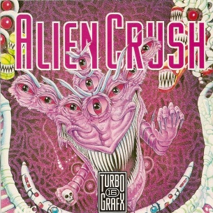 Alien Crush Aside from looking like Final Fantasy 6's Chupon on narcotics, that thing has way too many teeth and its eyes are coming out of nowhere. Because of this cover I was only willing to buy this game because the seller was also auctioning off Ninja Spirit, but the actual game looks incredible and is even kind of good. Unlike Alex Kidd and the Enchanted Castle which looked as bad as and sucked as much as the cover art. |
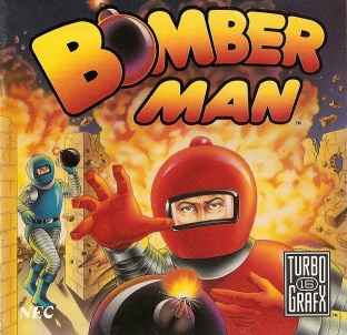 Bomberman This is one of those covers like Mega Man where it's an unwritten law or something to mention how awful it is if you make a bad cover arts list. |
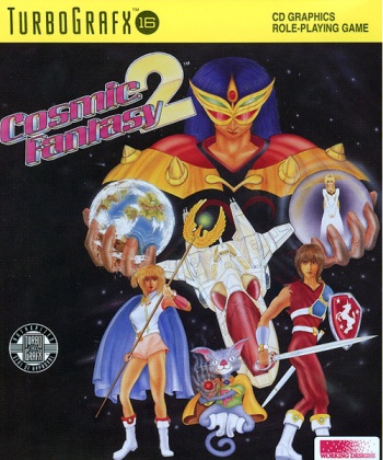 Cosmic Fantasy 2 Yeah, we've already gone over this one, but I had to include it. |
 Double Dungeons To give credit where credit is due, they did get it right that a snake's tongue comes out of the front of its mouth instead of the back like human's. But this cover looks more like our hero is in the world's worst Halloween haunted house than a monster infested labyrinth. |
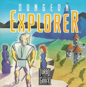 Dungeon Explorer I like the style they were going for, it's too bad the man looks like he's going to fall over due to his upper body weight. Of course, since he's flying, or a giant who uses his sword for a walking stick, maybe that helps. And at least the wizard seems to be in there for the purpose of looking at the castle: the woman is just there. |
 Dungeons and Dragons: Order of the Griffon Before you start scratching your head and asking me what I'm on, yes this one's cool. It's a very well drawn picture of a battle of magic and steel with a skeletal dragon. But it's a case of one little thing ruining an entire picture. 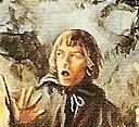 What the hell is this guy's problem? |
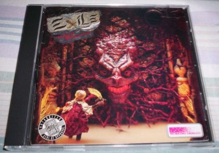 Exile: Wicked Phenomenon Goldilocks and the Alien Queen. |
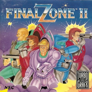 Final Zone 2 Hooboy, where to start. That's either some massive armor, or normal sized armor for fat people. The scan isn't too good, otherwise you'd see how the woman in the red suit is sucking in her cheeks. And the blue guy appears to have four arms, or maybe just both arms on one side. And finally, the bald guy in green and the woman appear to have to most disfunctional guns ever. |
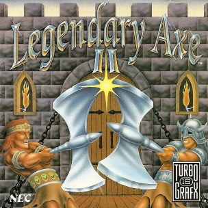 Legendary Axe 2 I commend the attempt at perspective, but it just didn't work. Instead of a dynamic clash we've got two jolly midgits - oh, I'm sorry - "little people" dancing around with their giant axes locked, perhaps after a few drinks from the pub they're standing in front of. |
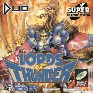 Lords of Thunder This is another one that's actually competently drawn, but something about it annoys the hell out of me. First, the quality of the "Lords of Thunder" is like they took a screencap of the title screen, cropped it, then pasted it on the cover. It also wasn't reasonably placed, and you can see a pair of female legs coming out from under the D. There's also way too much system and developer information (just compare it to the other covers featured here), and you're left wondering if the were trying to make this cover to look like crap. |
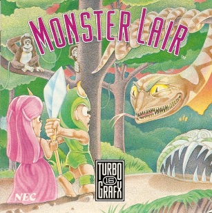 Monster Lair I think if the princess would let go of that sword-spear hybrid, the handle probably wouldn't have gotten bent. And I don't think what the knight is doing with his right arm is even physically possible. |
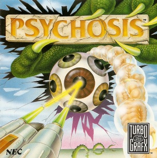 Psychosis This is a template for TurboGrafx shooter covers or something. Dead Moon and Blazing Lazers also feature a ship flying in from the bottom left and firing at some giant object in the center. At least Psychosis is unique by being as screwed up as the actual game. And yes, the game does feature strings of giant cooked shrimp in bubbles as enemies. |
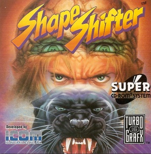 Shape Shifter At first glance, or from a distance, you'd think think game was about some punk biker kid. But then you get close, realize the glasses on his forehead are another set of eyes, and his hair is rock. Yes, the top of his head is a golem. And I don't want to think about what he's doing to the panther to make it so angry. In this game you can transform into four forms, including a Panther and a 'Rock Troll' as the manual calls it, which I guess is what this is trying to show, but the result is just creepy. Night Creatures pulled this idea off so much better, even if the man was poorly drawn. |
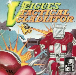 Veigues Tactical Gladiator Optimus Prime is so mad about this that he blew up an entire city. |
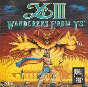 Ys 3: Wanderers from Ys Could somebody please explain to me how they got a beefy, shirtless Roman centurion with long brown hair, a winged helmet, and a skirt... 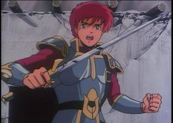 ... from this? While early game covers had a habit of misinterpreting the main character, they usually had SOME resemblance to that character and Adol even looks like that in the game's intro for some reason. |
|
Back to the File Cabinet |