So, a number of my articles deal with crappy video game covers. Some day I should look into making an article about game covers I actually like, but today I’m doing something else different and bang out an article on some crappy book covers. Or rather, the degradation of the covers in the Pip & Flinx series, in case you couldn't tell from the title of this article.
Pip is a flying, acid-spitting snake, or an Alaspin Minidrag/Mini-Drake if you absolutely must know. Flinx is a psychic redhead whose name is short for Philip Lynx, which raises the question of why he's called Flinx and not Philip. Okay, so maybe "Flinx" isn't as stupid as "Ceodore" or "Ninten" or "Rodimus Prime," but it's still a dumb name. Maybe Alan Dean Foster, back in the early 70's, consulted a psychic who told him there would someday be a franchise about a redhead named 'Philip' who goes by a name starting with 'F' that has more to do with his last name than his first, and his adventures through space with an alcoholic robot and a one-eyed sewer mutant, somehow misheard "alcoholic robot and a one-eyed sewer mutant" as "flying snake" and tried and make it his own.
That was tortured.
As of writing this I’ve only read two of the books. Love of Mother-Not had its moments, specifically any time the story was allowed to get away from Mastiff, but was ultimately brought down to sub-mediocrity by how prominent and distracting the old bat was, to the point I spent most of the book wishing she would fall in the bathtub and break a hip. Tar-Aiym Krang... well, it wasn't bad, but you can really tell it was Foster's first book. The writing was amateruish, most of the book was spent on history lessons instead of, you know, the Tar-Aiym Krang, and when something finally did happen with the Krang it was painfully anticlimactic. For cheese sake, you were 220 pages into a book that was "only" 251 long when the thing finally woke up. What else can you do in that time besides have the thing go back to sleep eight pages later? And what did that subplot with the niece plotting to kill that one trader woman have to do with anything? But neither were anywhere near as offensive as, say, No One Noticed the Cat, and I do intend to continue the series. I mean, why would I feel the need to write this article if I felt I was done with these guys?
In any case, I don't want emails containing spoilers for the other books, so if you think you're doing me a favor by explaining what's going on on the cover of Bloodhype, I appreciate the thought but you're not. I’d also like to tell anybody who’s thinking of sending me an email with the strawman argument/thought-terminating cliche “Don’t judge a book by its cover!” that I’m not, and that it’s perfectly okay to judge a book’s cover by the book’s cover, and to please go stab themselves with a fork. Onto the nitpicking.
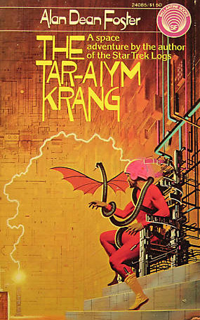

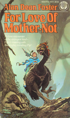
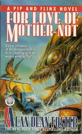
I'm going to ignore how misleading the first two covers are for a second and look at the images themselves. The first cover has some nasty color schemes going on and the font makes me want to hurt somebody. The second cover is still a little hard on the eyes, but it does grab your attention, and though you wouldn't know it until you read the book it's a lot more accurate to the actual even than the first cover. But both covers give you an idea of what's going to be in the book. Flinx is going to be enslaved by a sentient machine that wants to use him to destroy all organic lifeforms. Forget that doesn't actually happen, you got something to look forward to.
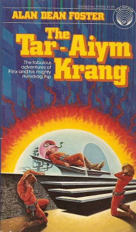
The third cover is definitely the easiest on the eyes, but also the least inspired. Okay, there's the planet Moth which the book describes in detail, and there's the Thranx, though I don't know why Flinx is surrounded by them when there were only three in the whole book and might as well only have been one. I guess somebody questioned why the first two depicted a scene that only lasted eight pages and two minutes in-story (Answer: That's still the most exciting thing to happen in Tar-Aiym Krang, which kind of tells you how irrelevent the rest of the book is) but wasn't sure what else to put on the cover.
Amazon advertised the third one, but a week later this is what I got in the mail…

Fantastic. A Photoshop masturbated image of some kid with eye shadow, an annoying glare straight out of the Team ICO school of art direction, and word art from the title card of some cheesy black and white Science Fiction movie. I'd also ordered Orphan Star. How did it fare?

Wow! ANOTHER Photoshop masturbated image of some kid with eye shadow, an annoying glare straight out of the Team ICO school of art direction, and word art from the title card of some cheesy black and white Science Fiction movie! But this time the kid's crouching! And everything's blue instead of orange! Will the wonders never cease?
By the way, I sympathize with the other two people on that second Tar-Aiym Krang cover. That's how looking at these covers makes me feel, too.

Shortly afterwards I ordered For Love of Mother-Not, and another week later I got yet another Photoshop masturbated image of some kid, except we only get his profile. But then again, there's no annoying glare. By the way, in case you haven't figured it out from looking at the top part, no, I didn't lower the quality of this image, the colors really are that flat on the book cover.
Let's look at some cover variants from older editions of those last two.
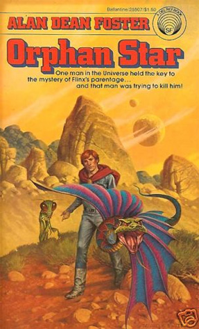

Neither Orphan Star cover is particularly exciting. The landscapes are nice, and Cover B has an interesting perspective. I guess I can tell by both covers the book takes place on a rocky desert planet with two moons, and a Thranx joins the two main characters. They're still a little HOLY SHIT, WHY IS PIP TRYING TO ATTACK ME???
Cover A isn't bad, but I can't get over how Flinx looks like he's wearing a bath robe with matching slippers. Cover B is pretty cool, though. It's colorful, interesting, and while it might be hard to make out on the scan, Flinx's facial expression is hilarious. Look, when I was watching my Captain N DVDs a week ago, I got the giggles every time Simon screamed. I'm a sadist, okay?
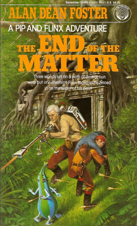
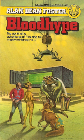
The next five books don't come in Photoshop Overload Migraine-O-Vision versions, and three of them are out of print anyway. So if you want End of the Matter, Bloodhype, and Flinx in Flux you have to get them used. When this came, I thought 'Hey, this ain't half bad.' There's action, a bit of tragedy with that poor sap Flinx is hauling off, and I like that temple in the back. It'd be perfect if not for that totally out of place space alien who looks like a piece of fruit with legs, who pisses me off further because his name reads like Foster randomly bashed his keyboard or typewriter or graphing calculator or whatever and went with whatever came out. I hope that arrow pierced his heart. There's a version of this running around that has the same picture cropped into a small circle bordered by orange, but it cuts out the temple and leaves the walking striped bowling pin with legs. There's also a completely different cover with Flinx standing on some space ship looking down on a rainbow ankylosaurus thing, but I was unable to find a good picture of it or a copy of the book to scan.
I guess now's as good a time as any to bring this up. Both Love of Mother-Not and Tar-Aiym Krang made several references to Flinx having dark/olive skin. Why, then, is he white as the driven snow on the cover of every book that hasn't been rendered incomprehensible by Photoshop filters? I guess I can hazard a guess on that one. Red hair and olive skin is not something we see very often, if at all. When we think of red hair we pair it with light skin, and when we think of olive skin we pair it with dark hair. The focus is much greater on Flinx's red hair than his olive skin, and I for one kept picturing him with fair skin, and judging by these covers so did other people. Maybe Foster got tired of trying to remind his artists Flinx wasn't caucasian, or maybe even forgot himself, and retconned it.

Cover A is... kind of lame. The monster is a mess, at first glance the woman looks like she isn't wearing clothes, then you realize she's wearing ugly yellow spandex, and then you realize there's a diamond-shaped gap in her suit where the top half of her asscrack is exposed, and I was about to comment on how ridiculous that guy's moustache when I remembered the book was written in the 1970s. Cover B fares better, and I would have much rather had that come in the mail. However, it suffers a little from Lords of Thunder syndrome, where there's so much extra crap cluttering the image it feels claustrophobic.
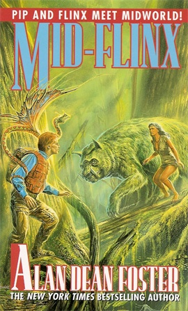
Mid-Flinx and Reunion are still being printed and without the "Oops, when we printed the master copy the printer was low on a color, and then somebody spilled water on it, but the deadline is today and this'll just have to do" effect, but the original Mid-Flinx cover is almost as ugly anyway. That may be a nice forest backdrop, but I can't get over how Flinx is supposed to be 20 in this book but he looks like a 50-year-old Marty McFly (he looks a lot worse on the actual book). The monster's also as gross as the thing on Bloodyhype Cover A. Note to prospecting monster designers, when you arbitrarily nail extra bits onto an animal - eyes, legs, ears, noses, breasts, dicks, whatever - they don't look alien, they just look ridiculous and you're a lazy sod.

Remember what I said about Orphan Star cover A? What is Pip's problem with the viewer? As nice as that forest and those mountains are, I can't tear my gaze away from an angry snake poised like it's going to spit in my face.
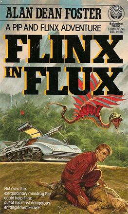
Cover B looks a lot like the Mid-Flinx cover, with Flinx standing on the left, Pip over him, and something to the right, which I guess makes sense since both covers were done by the same artist. And the names of the books are so similar I'd always get them confused. But the alternate Flinx In Flux cover is a lot more attractive than Mid-Flinx's. Flinx doesn't look like an old man, the color is great, and the aliens are eerie instead of stupid.

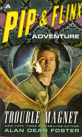
This is where we see a noticeable drop in the quality of the book covers. It's not as bad as the modern shit, but it's a boring Kodak moment with Flinx staring into the wild blue yonder thinking about how sassy he must look. And Pip looks like he's* getting ready to tear Flinx's throat out - or in following the pattern of some previous images, mine. As weak as Bloodhype A is, at least the artist was trying. Also, while it just came out last year and doesn't have a paperback edition yet, the cover of Flinx Transcendent also depicts Flinx standing against an orangey-yellow-green glare of a backdrop while Pip makes crazy moves around him. Yippy-tai-yai-yay.
* I might be misreading something, but the back of Impossible Places refers to Pip as a "she." Until I get to the part of whichever book states Pip is female and confirms I was reading the text right and it wasn't a typo, I'm calling Pip a "he".

And we're back to the new high-tech look. This cover makes me feel uncomfortable, and not just for the same reason as the first three books. I don't know whether to feel sorry for Flinx, sit down next to him, pat his back, and tell him it'll be okay, or like I've invaded his personal space and he's leering at me until I get the hint and go away.
And thank God that's the last cover with the obnoxious special effect bullshit. The rest of the covers are slightly more bearable to look at, but they bring me to another problem I have with the modern Pip and Flinx covers; they’re completely generic. In fact, the recent covers for Mother-Not, Krang, Orphan Star, and Folly don’t even have a winged snake anywhere in them, or if they do I sure as hell can't find it. So, not only are they pretty much interchangable with each other, except for Folly where he's older, they're interchangeable with non-Pip and Flinx books altogether.
Let's look back at some of those old covers. Many of them depict scenes specific to the book. Nevermind the only thing the guy who did Krang Cover A got right was "Flinx gets his head stuck in a helmet," the guy who did Cover B actually figured out what was going on in that scene. Mother-Not Alternate Cover A is when he’s starts out his search riding through the swamp on the… er… chocobo thing which name I forget of and can’t be buggered to look up. Alternate Cover B is when he’s on the boat with that park ranger chasing the old woman's captors across a lake when that giant fish comes out, eats the bad guys' mudder, and Flinx and the ranger have to work together harpooning it. And when I look at that cover to End of the Matter I got, I imagine there's going to be some frantic battle where one of Flinx's buddies get a bunch of arrows in his back and Flinx hauls him off. And maybe there's a scene in Bloodhype where a giant four-eyed and -armed turtle-crab thing discusses the manufacturing of Bloodhype with a woman who has completely the wrong idea on how to show off her cleavage and a guy with a stupid moustache. And Flinx In Flux cover A is when he finds Clarity unconscious,which kicks off the events of the book. I don't know what the new Tar-Aiym Krang cover is supposed to be depicting, because I don't recall a moment where Flinx stands around like an asshole while an A-bomb goes off in the back.

So, we've got the snake back, even if it does look like a soulless demon spawn with wings that would never carry it. And I guess the starry background is nice. But what am I supposed to expect from this book? Yeah, I'm sure there'll be a scene where Flinx stands there while Pip flies around, just like every other book.
Maybe I should count my blessings. The inside cover of Flinx's Folly shows a prototype image of Sliding Scales's cover, which is another "obnoxious streaks over an image of Flinx dissolving into a blur" like Folly, only Flinx has his arms crossed, his back turned to the viewer, and is turning his head back to look at the viewer, making him look like a cocky bastard. I admit I've only read two books, but from what I've read Flinx is not a cocky bastard. It'd scan it, but I don't know how to without ruining the book.
Again, this gives me no idea on what to expect from the book or what it's about, and also leaves me wondering where Flinx is standing. In front of Unicron? The Mega Man X6 title screen? With the X4 title screen superimposed in the middle? The interior of the Death Star about to fire on the planet behind him? And why is Pip so angry at the viewer on so many of these covers?
Oh yeah, and while every cover has made him fair instead of olive skinned, this is the first time they got Flinx's hair color wrong, making him dirty blonde instead of a redhead, though it's hard to tell what the original color was supposed to be on the more oddly colored ones. Prepare for more Flinx hair-dying antics, because he goes brunette in the next book.

Oh! I get it! See, the title of this book is “Running from the Deity”! And they’re running! From the deity! HURR HURR HURR.
Actually, they're running from a mob of primitives. And according to the back of the book, Flinx is the deity, or so the primitives have been led to believe, which means Flinx is running from himself. Or maybe everyone in the picture is running from a real deity, wouldn't that be a laugh!
And what's going on with Pip's wing there? It's a single feather coming out the back of his head.

The whole "hero fighting a mass of tentacles trying to consume him" thing is cliched and Flinx's facial expression is made even goofier by the fact he's not facing what he's shooting at and looks like he's wielding a power drill. I'm also not sure why you'd put a picture of our hero trying to avoid a Japanese tentacle rape on the cover of a book that, according to the title, is about fatherhood. Actually, forget it, I don't want to know.
That said, the book is supposed to be about Flinx finding (about) his father. I'm going to make a guess now that his father is going to be either the bounty hunter the back of the book says is chasing him, or the guy with the star map whose neck Flinx got broken at the beginning of Tar-Aiym Krang when he directed the two thugs to him, which would mean Flinx indirectly killed his own father, wouldn't that be a laugh!


These's aren't proper Pip and Flinx books. They're collections of short stories that Foster put his signature characters on the covers of because one story in each is about them. Impossible Places is relatively peaceful to look at while Exceptions to Reality is another special effect clusterfuck and makes me laugh every time I see it because it looks like Flinx is totally fascinated by the critter he's been hanging out with for years by now. And it's made even better when I put the two images side by side, because it looks like Flinx A is looking at Flinx B and thinking about how stupid he looks.
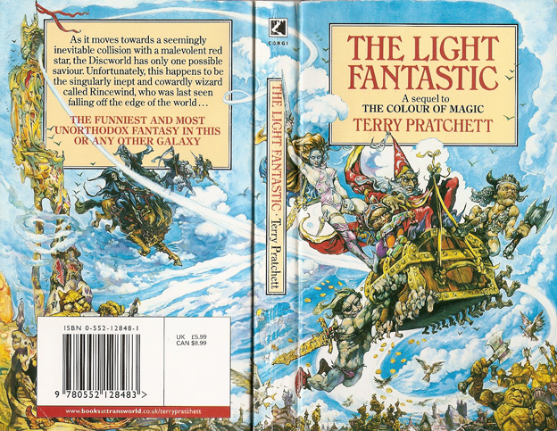
So yeah, most of the early covers were decent, and while some were weak, they at least had souls. The modern ones range from bland to goofy to downright irritating. And with that, I'm going to leave you with the single greatest book cover I have yet seen, which I found at Page One when I found the Mother-Not cover with the boat: The Light Fantastic as interpreted by Yoshitaka Amano on narcotics.